The Light Box Mumbai
While refurbishing a 6-decade old house when we came across an adjacent structure that was abandoned for over 30 years. A while later the owner approached us asking if we were interested in converting it into a commercial storage unit which he disclosed used to a public library built in 1965. We were so awestruck by the history that we couldn’t deny.
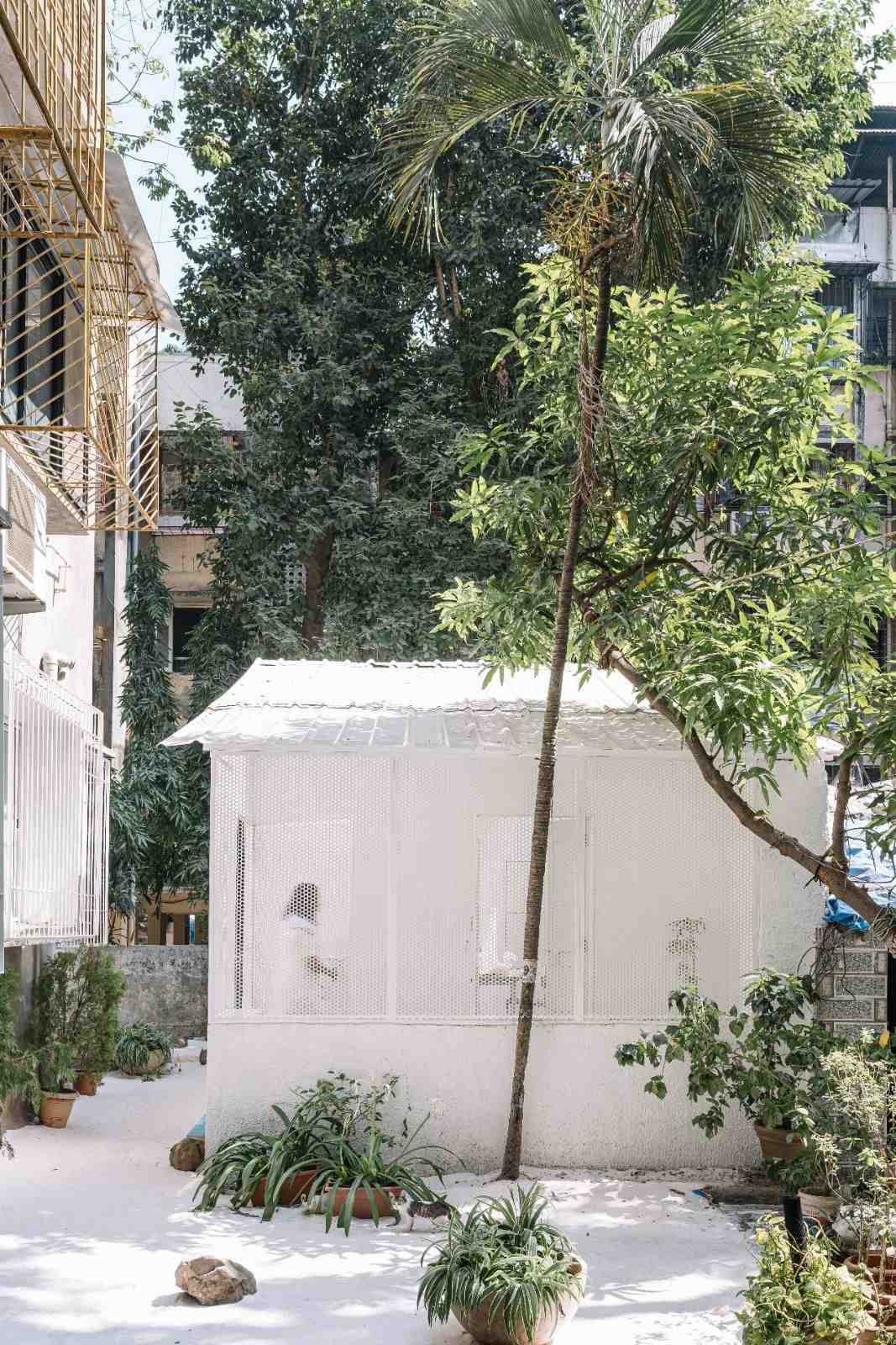
We started by fracturing the conventional block while retaining the structural old bones of the library to develop a simple yet modern skin that blends with the immense city of Mumbai. Smooth, unadorned walls and angular roof. The new elevation is subtle and distinct which generates a sense of peaceful and inspiring atmosphere. This was going to be our space for creative incubation, a space that responds to and reflects the nature of the work we do and a space to dream.
The studio was not an act of rebellion but one of necessity, of meeting certain demands economically we took a reductive design approach to pair it back to just the elements that needed to make it function. We were challenged with turning the existing load bearing library into a functional studio, while being sensitive to the existing structure so we preserved the building's original, ‘framework to conserve its embodied carbon footprint and celebrate the site's past.’
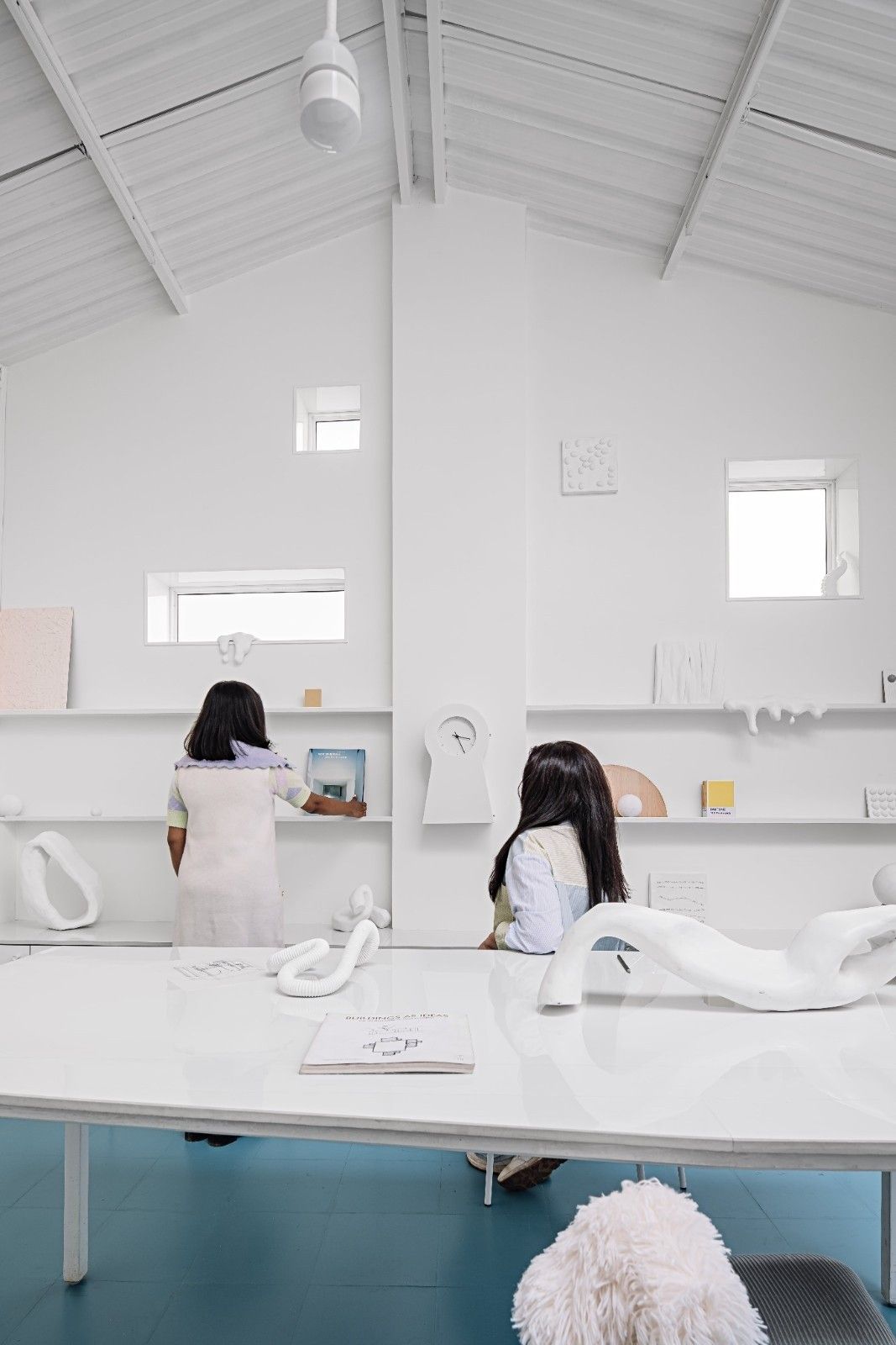
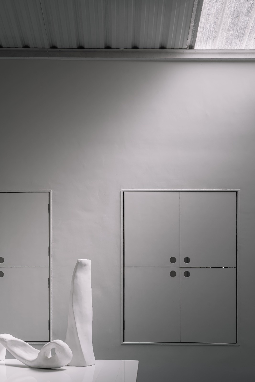
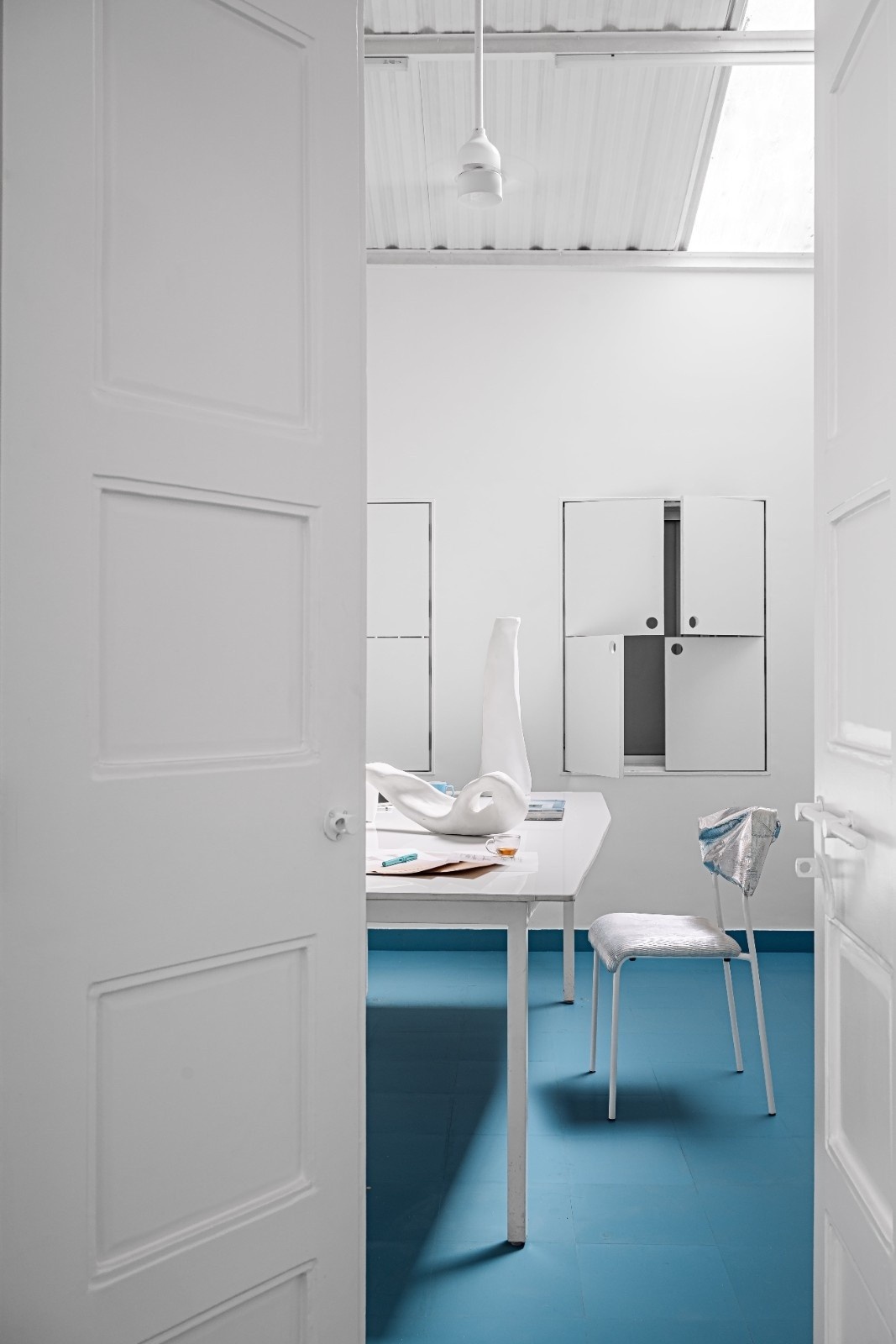
Its dense urban context required an innovative solution to increase the floor area while introducing natural light throughout the spaces. We devised a scheme that involved raising the structure's roof to increase the flooding of light. The screen, skylight and windows were carefully orientated to catch light and provide the studio space with ample natural light for the team to work in during all seasons.
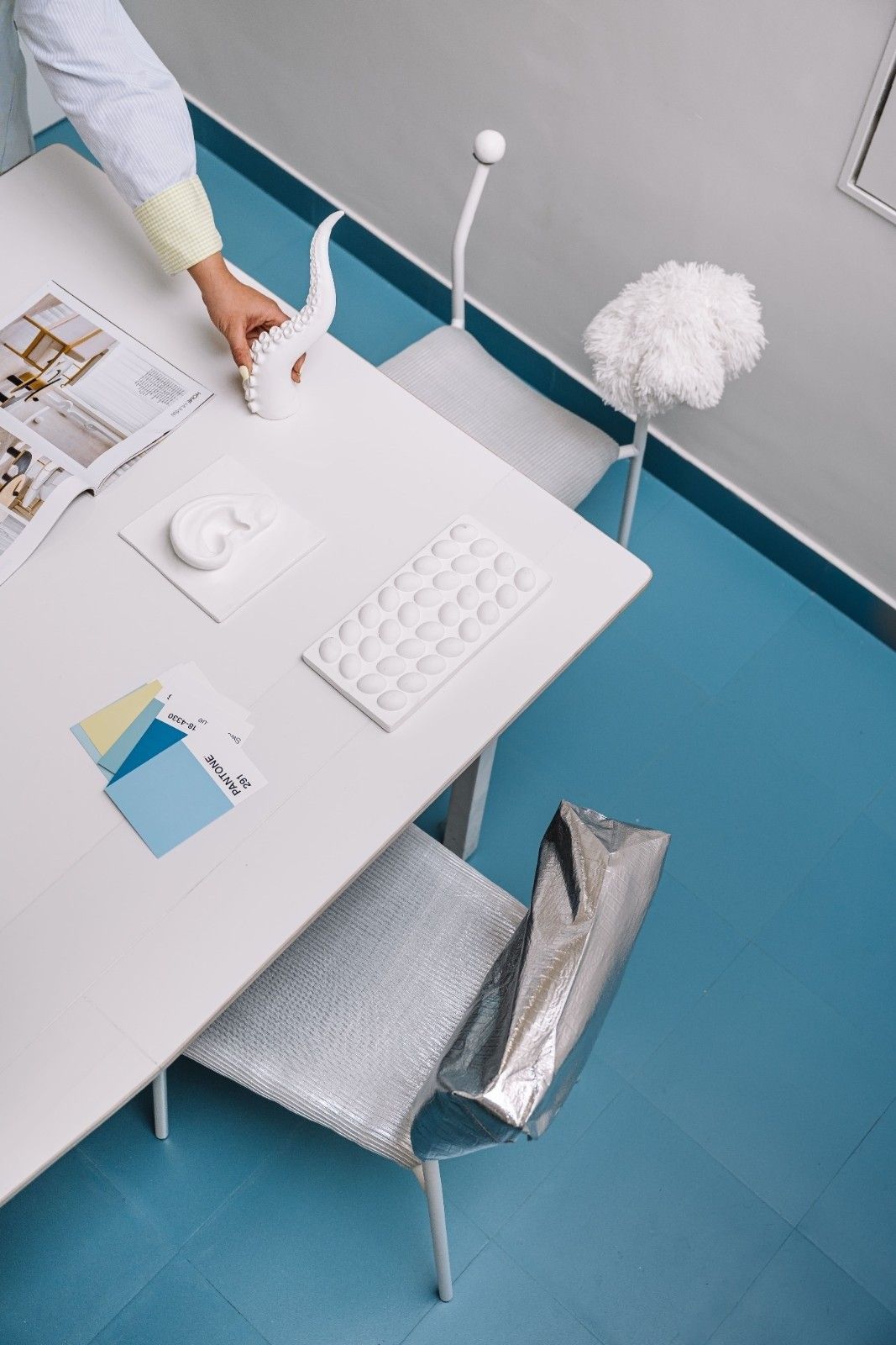
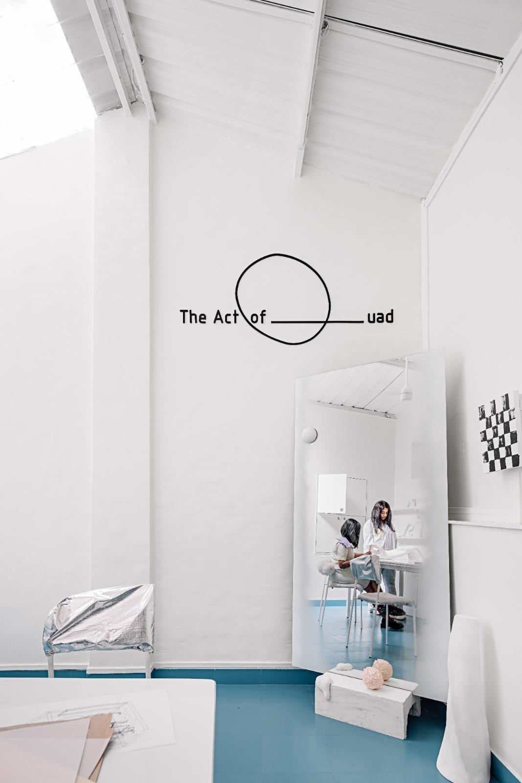
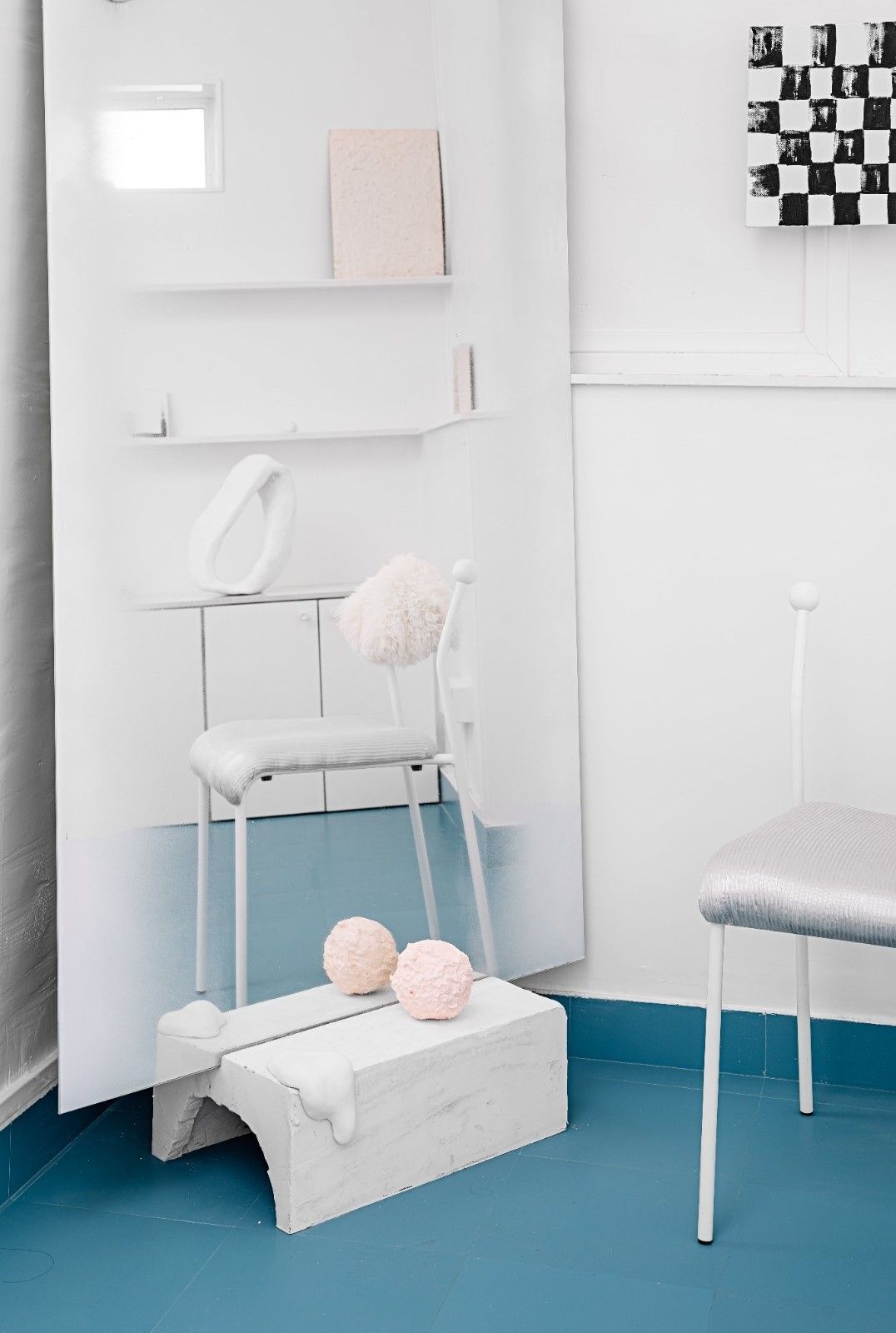
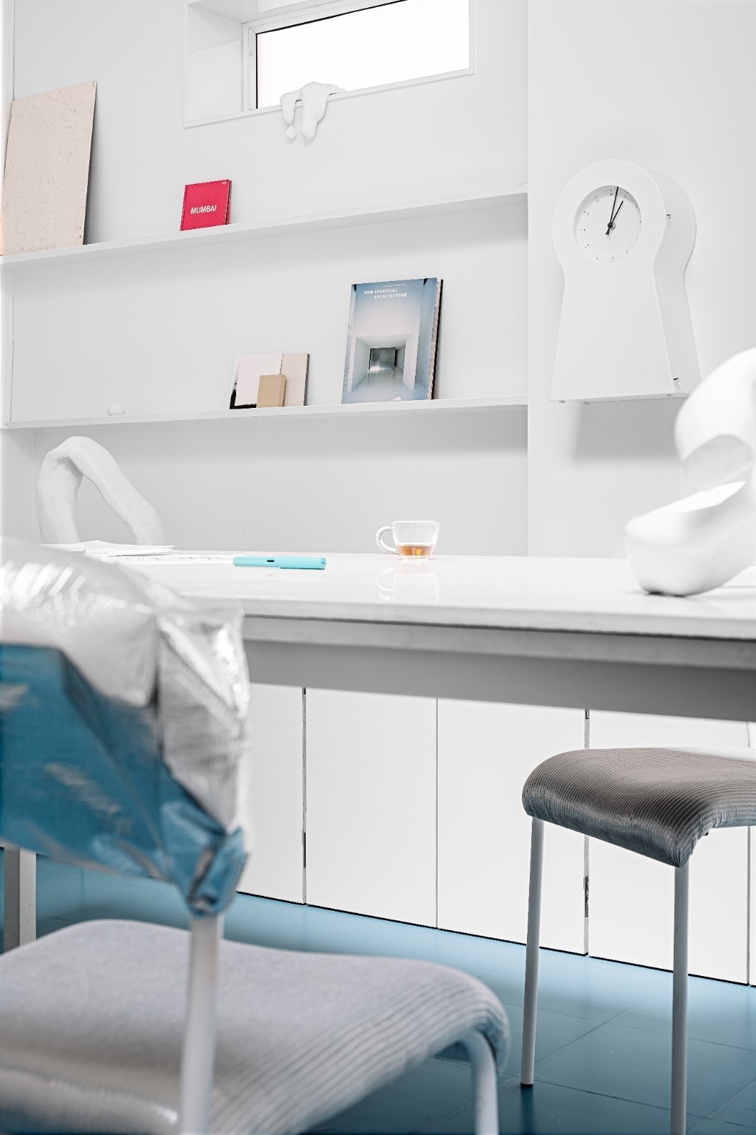
The stark white scheme of the studio was intended to mimic a blank canvas, to visual materials and projects.Our studio is singular like a ‘light box’. The light, instead of being drawn in great waves, is artfully framed and focused and the striking contrasts of the Zima blue floor becomes the most colourful element one could imagine.
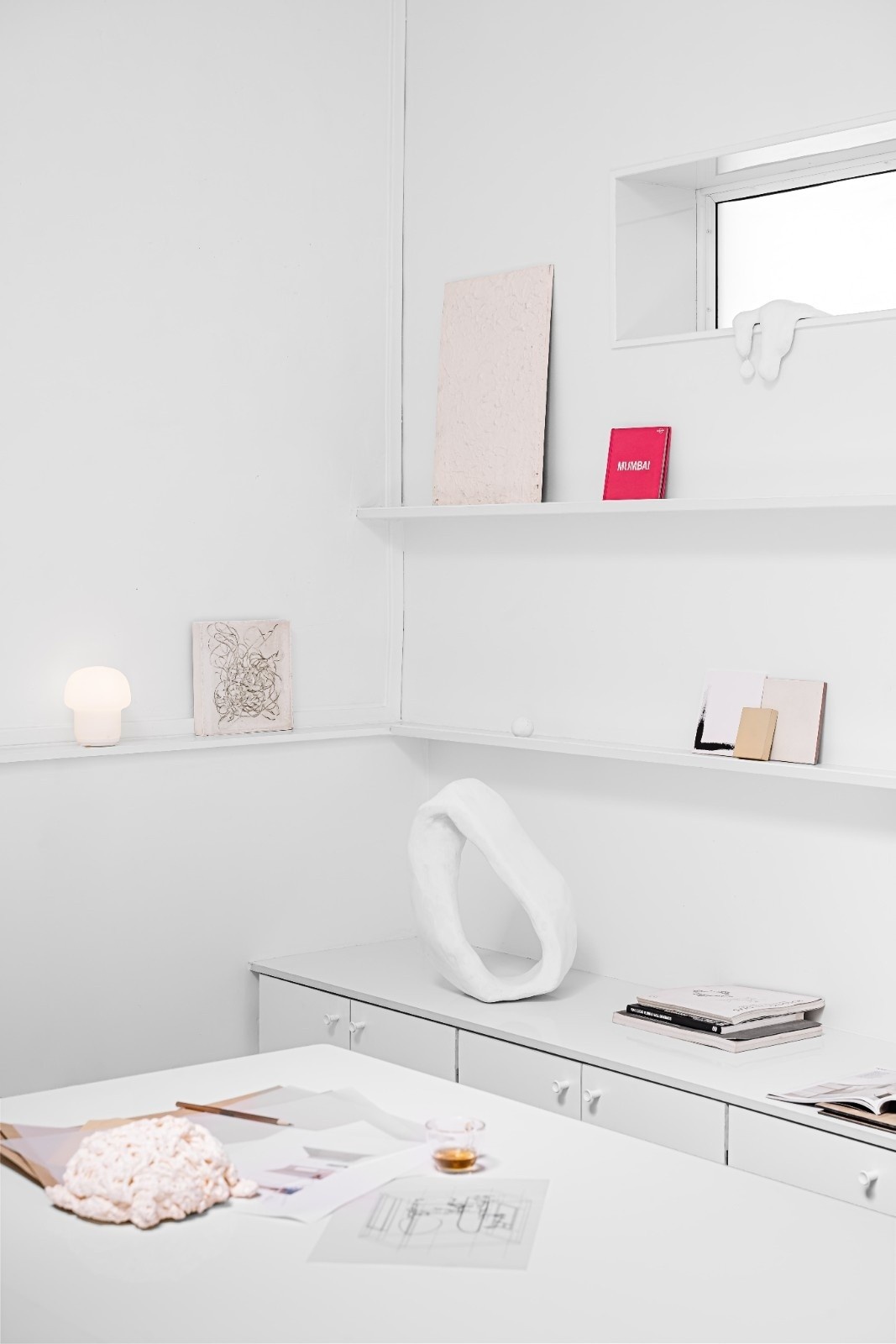
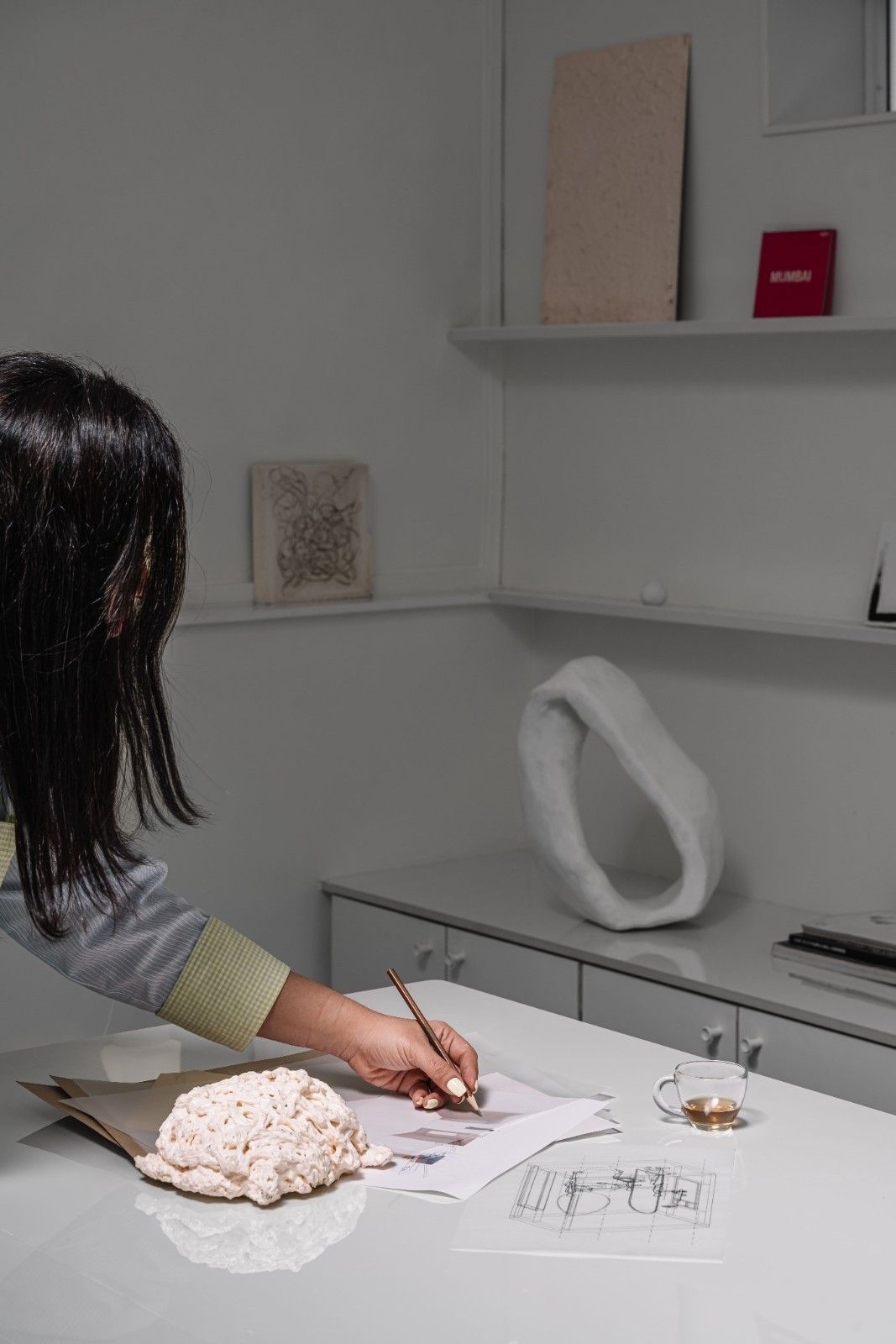
Anchored around the communal table we generated a socio petal space for a more collaborative and playful environment. The bespoke table documents the progression of our day that alternates between our design tools, meals, cats, and a lot of sketches on the table that look like a wreckage at the end of the day.
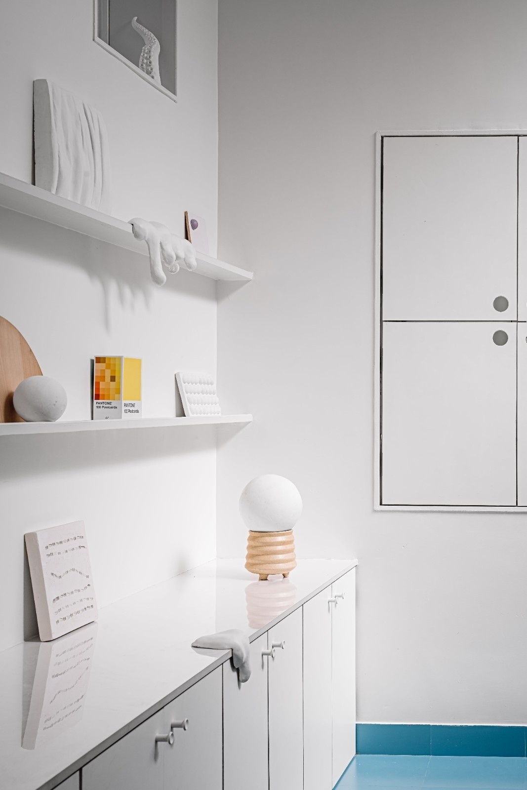
In contrast to our gallery wall that houses objects, materials, and book of our interest we have a textured blank wall under the skylight that acts as a canvas to focus on to think nothing. Yeah nothing. We encourage time off our screens to get a little zoned out or even bored because that when the real ideas drop by in our minds.
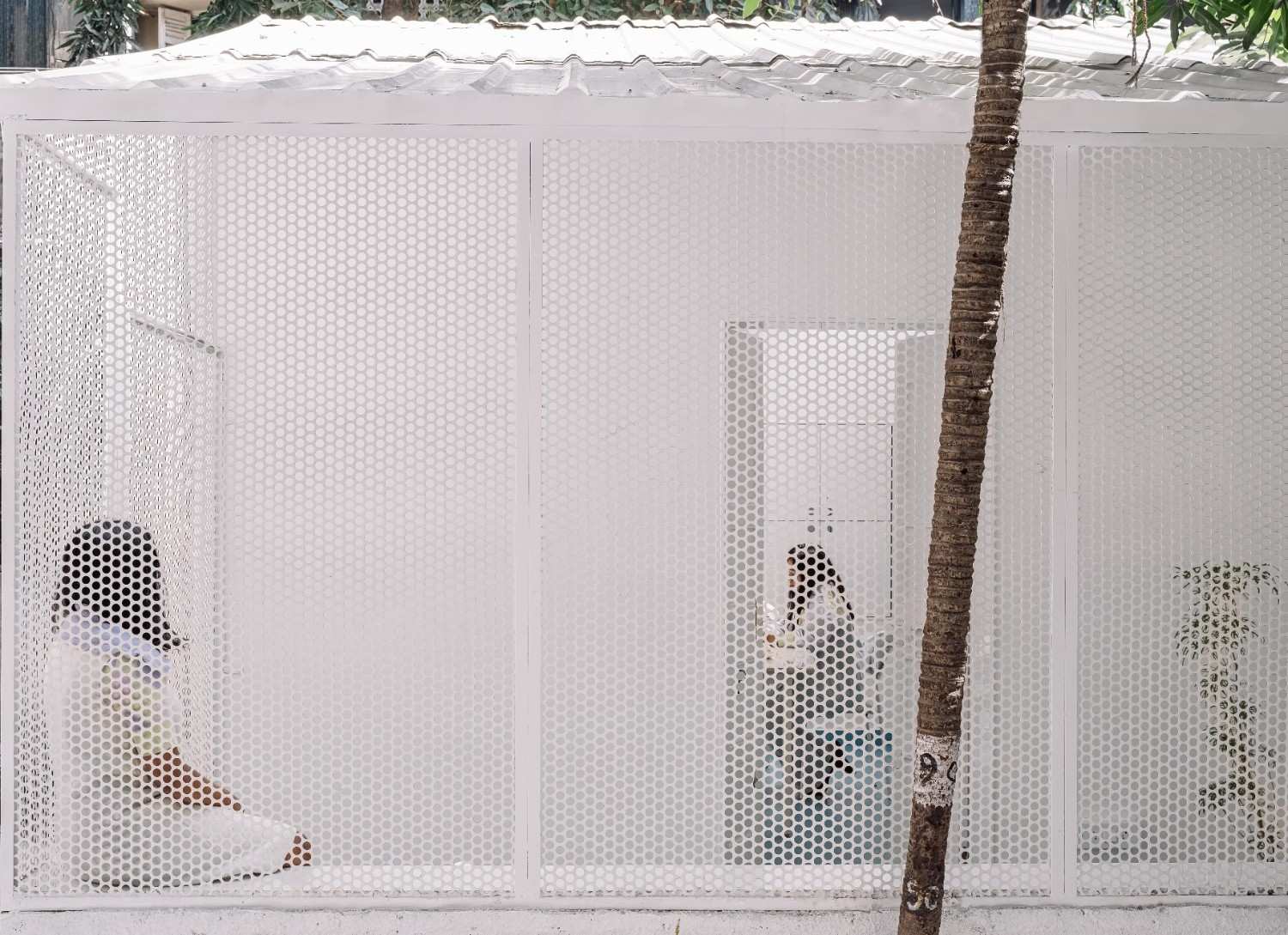
Out of our mildly isolating studio we have a little break out space that connect the studio and the city through a punctured screen that provides privacy from the people passing by as it is a ground structure.
The studio space becomes a sensorial oasis in a saturated, digitized environment. This micro footprint of around 200 Sqft is designed to work hard to resonates with our multifaceted roles.
PHOTOGRAPHY: Ishita Sitwala YEAR: 2022
